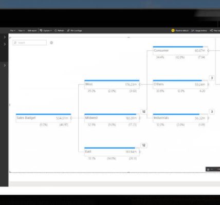
Use AI visuals – Visualize and analyze the data
Use AI visuals
Some visuals in Power BI can leverage AI, allowing you to apply advanced analysis to your data. We’ve already covered the Q&A visual in Chapter 2, “Model the data.” In this section, we cover the Key influencers and Decomposition tree visuals.
Key influencers
The Key influencers visual helps you understand the variables that drive a metric. For example, you may want to understand what influences profit to increase, and you may be looking at factors such as location, buying package, and time of the year. The Key influencers visual will analyze the data you provide and rank each factor in terms of importance.
The Key influencers visual has the following field wells:
- Analyze The metric you want to analyze. It can be continuous or categorical.
- Explain by The factors you want to check in terms of influence.
- Expand by When analyzing a measure or a summarized field, you can increase the detail level without considering these factors as influencers.
In the Wide World Importers example, you can build a Key influencers visual as follows:
Select the Key influencers visual from the Visualizations pane.
Add Profit from the Sale table to the Analyze field well and ensure that summarization is set to Sum.
Add the following fields to the Explain by field well:
- State Province from the City table
- Buying Group from the Customer table
- Buying Package from the Stock Item table
Add Year and Month from the Date table to the Expand by field well.
The result is shown in Figure 3-54.
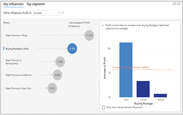
FIGURE 3-54 Key influencers.
You can select each bubble to see how it influences Profit. For instance, the right half of Figure 3-54 shows that when Buying Package is Each, Profit is more likely to increase. Also note that Buying Group is not a major influence on Profit, since it’s not shown in the visual.
Whereas the Key influencers tab in the Key influencers visual shows how each factor individually affects a metric, the Top segments tab shows how a combination of factors influences a measure. The Top segments tab is shown in Figure 3-55.
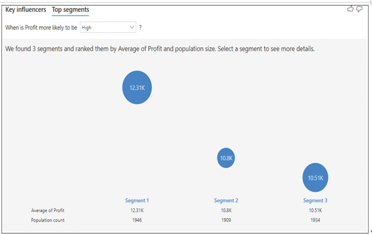
FIGURE 3-55 Top segments.
Below each segment, you can see the average profit in the segment and the population count, or the number of records you have for the segment. Note that in this case average does not mean the average of the Profit column but instead the average of the aggregated Profit value, which in this case is sum.
You can select a segment to see what it consists of and how it compares to the overall population. Figure 3-56 shows an example of a segment.
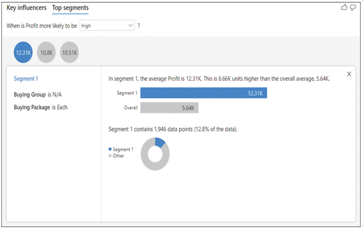
FIGURE 3-56 Top segment example.
The Key influencers visual is appropriate to use when you want to find out the most important factors that affect a metric you select. You can also compare the relative significance of each factor.